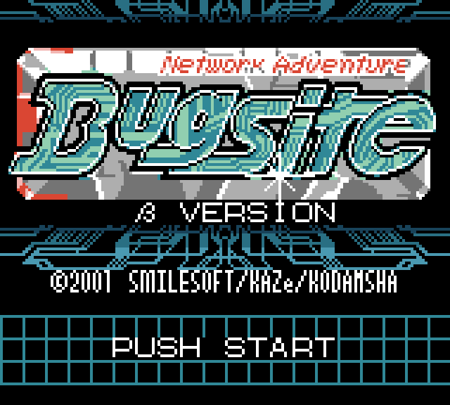
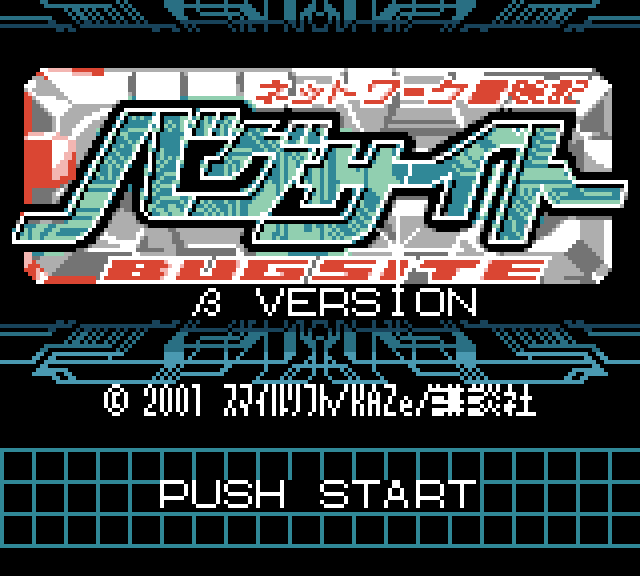
So, I happen to be a ROM hacker and I work on code and modifications for two Game Boy mongames. One of them is Telefang, slightly notorious in certain places for having been badly translated into Chinese and then English... and then marketed as "Pokemon Diamond and Jade". This is not an article about Telefang. This is, however, an article about Network Adventure Bugsite, which didn't have an English titlescreen until last month.
I'd show Alpha version's as well, but they're damn near identical. Did I mention this game seems kind of unfinished?
The process of altering a titlescreen in this way is more difficult than it seems. A particularly naive idea would be that it just involves drawing a new image, so it's the easy work. In fact, that is pretty far off. Due to various hardware limitations, title screens on Game Boy games are particularly difficult to design and develop. The "easy" part of designing the new logo itself requires considering things like color limitations and attribute clash problems. Of course, designing the logo itself is a pain, too!
Translating Display Typography 101
I call this "easy" mostly out of a lack of respect for actual graphic designers. Logo design is an incredibly complicated art of it's own, intersecting both typographical concerns, color choices, trademark lawyers, and so on. Occasionally, someone will also have the chance to merge a graphical element related to the product or company in question into the logotype. (I've been informed that graphic designers have a fetish for this.) The whole point of a logo is that you can take one look at it and know what the product, service, or company is and does.
The shape of a logo is both to serve the function of type and graphics, much like how song lyrics marry phonemes to poetics. This makes the translators' job a living hell. The type design alone will often be of a particular style that doesn't really make sense. Japanese has three writing systems, all of which will appear aesthetically different. (Possibly even to Japanese-illiterate people.) Words written with hiragana 「ずかんより」are loopy and organic; katakana 「ガイコクジン」are naturally inorganic like geometric Latin type; and kanji 「奇妙冒険」are generally visually denser conglomerations of the above styles. Oh, and they also throw in romaji 「Everything You Know Is Wrong」because it looks cool.
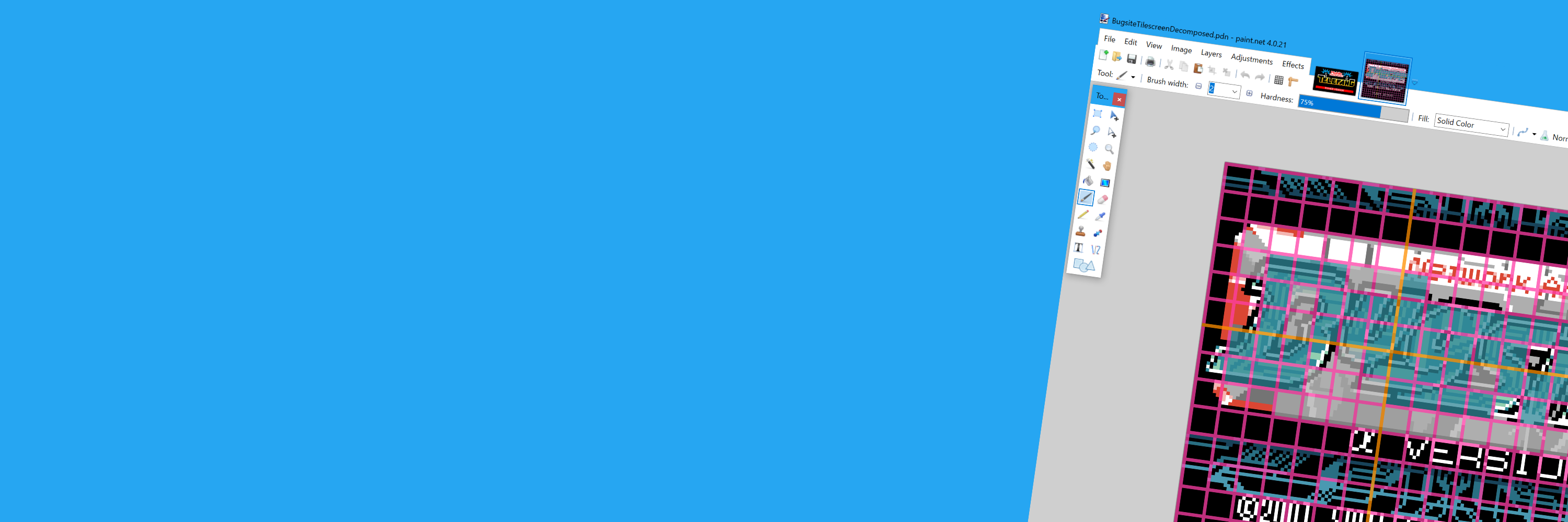
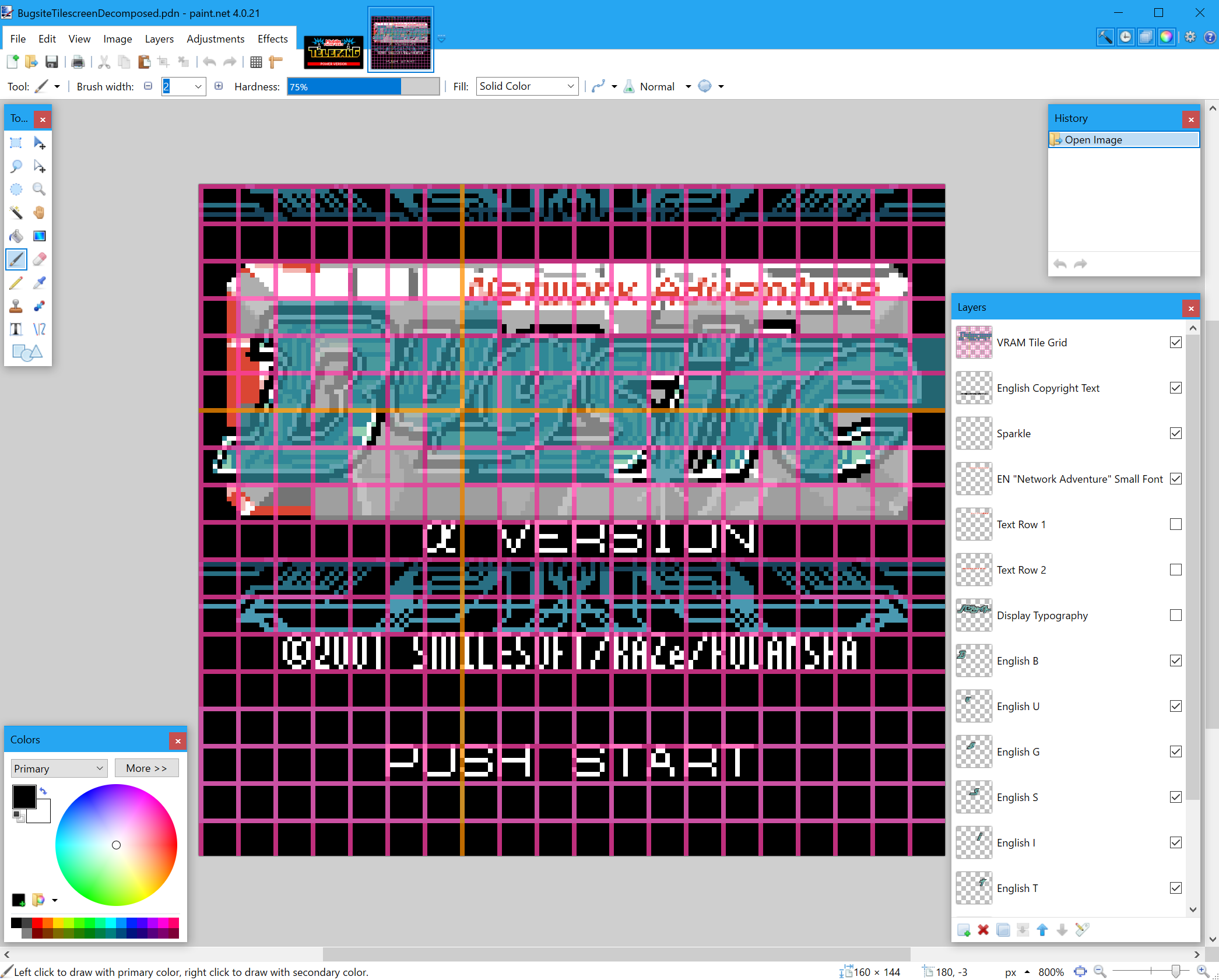
Further complicating the issue is that the existing logo graphic is a layered design with multiple elements. I first had to take an emulator screenshot and carve it out into layers using an image editor. (Paint.NET in my case.) I filled in each part of the layer that was obscured until I had a complete separation; and then I created new layers to hold the new logotype. I still needed the old logotype, because I needed to pull it's existing color values to stay consistent with the Japanese logo. And then I drew each glyph as a separate layer on top of the existing logotype.
It's not quite "5000 hours in MSPaint", but it's close...
Bugsite's largest logotype is written entirely in katakana (the angular, geometric syllabary) and the original designer chose to emphasize the linear aspects of the glyphs over the circular. For whatever reason, I decided against retaining this aspect of the font face. English Bugsite is notably much rounder; because the characters in use are inherently round. Part of me wants to say that having an extra two glyphs means we have less space for boxy glpyhs to take up; but I won't claim that was the official reason. The glyphs also flow into one another - the "stem" of the 「バ」 leads into a matching feature on the 「グ」, and the same with the 「サイト」.
I originally drew the "sit" in the same way, elongating the bottom half of the "s" backwards to try and retain the linear-favoring style of the Japanese logo. But, unfortunately, "it" kerned this way looks like an "h", and the game is called "Bugsite", not "Bugshe". So I had to move glyphs around to specifically disrupt anyone from trying to perceive an "h" there, if I didn't want to end up on /r/keming.
(I also snuck in a subtle Internet Explorer e 'just cause.)
To be honest, after all the faffing about with redesign, it sort of looks like the logo of some forgotten Taito puzzle game:
This is one of the follies of logo translation; the original intent can be lost if you aren't careful. There's a similar problem with Telefang's English logo, which looks less chaotic by virtue of having a consistent baseline. I suppose I could have been more conservative with Bugsite's logo design, and I may give it another pass. I was, however, able to preserve the same graphical elements the original logo has; such as the printed circuit board traces that pepper the inset background of the primary logotype.
You may have already noticed that the third row of type that says "BUGSITE" in the original is now gone. Japanese logos love to add the same text in both kana or kanji as well as romaji. It serves no purpose for the domestic market, but it looks cool, much like American children's toys with kanji plastered all over the box or people who get Chinese language tattoos they can't read. In this case, it's redundant, so it was removed.
An alternative I considered was splitting the top title and putting "Adventure" at the bottom. However, this breaks standard English reading order. Some logos do this, but the risk of someone reading "Network Bugsite Adventure" was too great and it wouldn't immediately feel wrong to do so. (I'd also wind up on /r/dontdeadopeninside, arguably worse than /r/keming.) Hence, I did not explore this option enough to even give you an example of what it would have looked like.
The line at the top of the screen is just "Network Adventure" in Japanese, so it just becomes "Network Adventure". Some translations might decide to change the title outright; it is kind of awkward. However, I'm the programmer, not a localization expert, so I am leaving that line as-is. That being said, just keeping "Network Adventure" on one line like that posed a rather unexpected challenge down the line...
A Clash from the Past
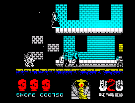
The average Spectrum game did not do well with color. Source
Many 8-bit computer systems have a tile-and-palette based notion of color. That is, colors are not assigned to each individual pixel like a modern system wood. Such a setup would consume far too much memory! Instead, the screen would be divided up into tiles of 8x8 or 16x16, and these tiles would have an attribute that assigns that region of space a color palette. Pixels within that space would have a color index into that palette.
Of course, because palettes are limited to four colors; so is each tile. This results in a problem called attribute clash, which is most noticeable on ZX Spectrum games due to only having two colors per tile. Game Boy Color's four color palettes are more forgiving, but it also has another feature to fight the color clash: sprites.
Sprites are tile-sized images that can be overlayed on top of the existing background layer. Since we need transparency, they lose one color out of the four, but they also carry their own separate palette. Thus, by carefully positioning sprites with additional pixels on top of our background image, we can add three additional colors at a time, which lets us extend each tile from 4 to 7 colors at once, or even more if we use more sprites.
However, there are additional limitations. The Game Boy only has enough memory for forty sprites across the whole screen. Furthermore, the hardware can only render ten sprites per line, so any more beyond that will simply disappear. I actually ran into this limit at one point during testing, and it's extremely confusing when you do encounter it.
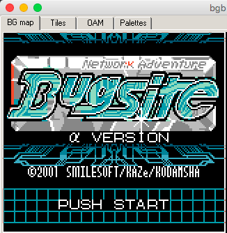
On this emulator screenshot, you can clearly see the background layer only, without any sprites. The original game looks much the same as this, in terms of attribute clash - arguably moreso. In fact, there are a few points where we got lucky, such as the bottom left corner of the "e" where the attribute clash is barely noticed. Places like those are where you'd avoid putting a sprite if you can help it, because that's another limited resource. The idea is to fill the tilemap with the color palettes that match as many pixels as possible; and then cover up the attribute clash with as few sprites as possible.
You may notice part of the "k" is filled in on "Network Adventure". This section in general is difficult because it's a clashing color. The original logo pushed the red color onto sprites, but not all the sprites. It actually has another background palette with one of the reds replaced by a grey so that some of the text can live on the background layer, at the expense of some anti-aliasing. Why? Well, because there isn't enough room for sprites to cover the whole width of the word. Further compounding this is the fact that this is also an animation; more sprites will appear on the same raster line and visibly conflict.
My solution to this was to first change the animation to minimize the amount of sprites present on the line. For example, the red strip on the left used to be constructed of sprites, but I deleted them to free up more pixels on the line. Some of the animation sprites were aligned to a grid, so I just pushed them down a bit and brought their content tiles back up. At the end of all this, however, I was still coming up one sprite short. Luckily, there was one tile with no grey whatsoever, which I could turn red with impunity - the top half of the "k". Thus, what would have been really obvious and unavoidable attribute clash is now just a few incorrect pixels.
ROM Graphics Injection for Dummies
Now that we have a background layer and sprite placements planned out, obviously we just need to open up our favorite in-ROM tile editor and copypaste the data in. Do not do this ever, especially on large modding projects like a fan translation. You'd want to have an actual build system, assembler, and graphics compiler in order to be able to inject data into a base ROM repeatedly and correctly, as well as have an idea of what changes you made. If you don't know how to do that, then just go and copy how the Telefang and Bugsite disassemblies work. I'll cover build systems for retro game mods in a future article.
In the case of Bugsite, our game has it's own rudimentary filesystem that indexes almost every piece of data in the ROM; and we've already extracted that data into PNG files that can be edited by a modern graphics editor suitable for palette-constrained pixel art. Injecting the background layer required taking my screenshot mock-up drawing, flattening it down into a single background layer, changing the colors to greyscale values (Paint.NET's Recolor tool is handy for this), and then copying each row of tiles into the actual tile data, which is not stored in any convenient ordering that makes this easy. (For some reason, they put the right half of the logo separate from the left half, instead of going row-by-row.)
However, that only covers background layer assets. Bugsite also has sprites on it's titlescreen, which are animated. I actually had to spend a few weeks reverse-engineering how sprites are stored, which results in this mess that I swear is a description of how the title screen is animated. It's ordered very weirdly even if you know how my sprite assembler syntax works, because the title screen sprites sort of shift around the rest of the animation. But having this file was also nice because I could adjust the timings of the animation so that it would play one frame per second and thus inspect each frame individually for errors. That's why the sprites don't jump around or disappear despite being right up against the limit of hardware.
After several cycles of iteration, jumping between bgb and editors, and generally pulling my hair out, I finally got a result that I could agree with, and it wound up landing in patch version 29 which you can download here if you're adventurous and like playing a minimally translated game. It actually wound up taking half of that month's release cycle just to be able to do this, but the result makes the translation patch look far more professional, in my opinion, even if I think there's still room for improvement in future releases.